eCommerce transactions have been soaring up in the past few years, especially when the pandemic hit the world. Many people have turned to online shopping as a way to avoid going out in public places.
In the US alone, there has been a 25% increase in eCommerce sales from March to April 2020. This trend will continue as people become more comfortable buying things online. More importantly, eCommerce sites offer an exceptional purchase experience with a wide variety of product selections, fast shipping, and easy returns.
These things can’t be expected from offline stores where customers have to physically go there, look for what they need, and stand in line to make a purchase.
As an eCommerce business owner, it’s important to ensure that your website is designed to encourage people to buy products from you. One of the most important aspects of an eCommerce site is the checkout process. You want to make sure that your checkout process is as smooth and streamlined as possible.
Or, if someone visiting your website intends to leave without making a purchase, you can use an exit-intent popup to try and change their mind. Exit-intent popups are a type of popup that appears when a user is about to leave your website.
They are designed to capture the user’s attention and persuade them to stay on your site. Exit-intent popups can be highly effective in getting people to take action on your eCommerce site whether it’s subscribing to your newsletter or making a purchase.
Here are a few tips to make compelling exit-intent popups to attract your audiences:
1. Use a Simple Design
Your exit-intent popup should be designed in a way that is not intrusive and can be easily closed if the user wants to. That’s because the last thing you want is for your popup to be so annoying that people will leave your site just to get rid of it.
This is why it’s essential to use a simple design that’s enough to capture your audience’s attention. If people are distracted by crowded design slash animation, they won’t pay attention to what you’re actually offering.
2. Write a Compelling Headline
Your headline is the most important part of your exit-intent popup because it’s what will capture the attention of the user. Make sure your headline is clear and concise, and relevant to what you’re offering.
For example, if you want people to subscribe to your newsletter, you need to include a line that says, “Subscribe to our newsletter for exclusive deals and discounts.” This headline is clear and concise. It tells the user what they will get by taking action.
3. Use a Call to Action Button
Your call to action (CTA) button should be clear, visible, and relevant to the offer you’re presenting. For example, if you’re offering a discount on a product, your call-to-action button should say something like “Get Your Discount Now.”
Make sure not to use irrelevant words in your CTA button. If you’re offering a product bundle, don’t use the word “buy” in your CTA button. Instead, focus on the words that will persuade the user to act, such as “get” or “claim”.
4. Use a Sense of Urgency
When you’re creating your exit-intent popup, it’s important to create a sense of urgency. You want people to feel like they need to take action now, or they’ll miss out on something great.
For example, if you’re offering a discount or some other time-sensitive offer, make sure to include that in your exit-intent popup. This will create a sense of urgency and encourage people to take action now.
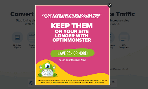
Via OptinMonster
5. Include a Clear Image
People are visual beings, so make sure your exit-intent popup includes a relevant image. This will help capture the visitor’s attention and make your popup more effective.
You can find images attached to the exit-intent popup because it attracts people first, then words. Not to mention, images are more visually pleasing than a few lines of text in a box. So, you need to include a clear image related to what you’re offering.
6. Target Your Audience
Make sure your exit-intent popup is targeted at the right audience. There’s no point in showing an exit-intent popup to someone who has already purchased on your site. Instead, focus on people who are about to leave your site without buying anything.
This can be done by segmenting your audience and only showing the exit-intent popup to people who are likely to be interested in what you’re offering. For example, when people visit your site for the first time, you can show them a different exit-intent popup than people who have been to your site before.
7. Test, Test, Test
As with anything else in marketing, it’s important to test your exit-intent popups to see what works and doesn’t. Try different designs, offers, and call-to-action buttons to see what gets the best results.
Make sure that you’re enticed to follow the exit-intent popup instruction before you leave the site. This will help you understand how effective your popup is and whether or not people are actually taking action on it.
6 Popular Exit-Intent Popup Providers
There are a few exit-intent popup providers that offer ready-made solutions that you can use on your eCommerce site.
1. Trtle ‑ Buy Now Upsell
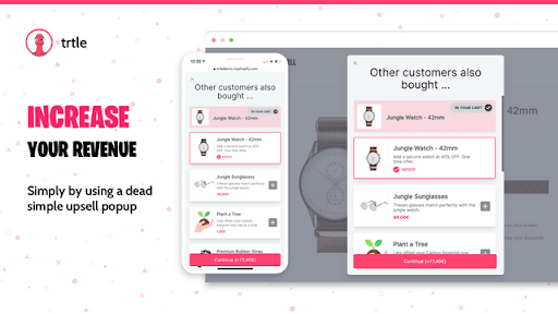
This app is designed specifically for Shopify stores. Trtle from Shipway helps you create upsells and cross-sells to boost your sales. It offers a wide range of features, including an exit-intent popup, A/B testing, and a drag-and-drop builder.
2. OptinMonster
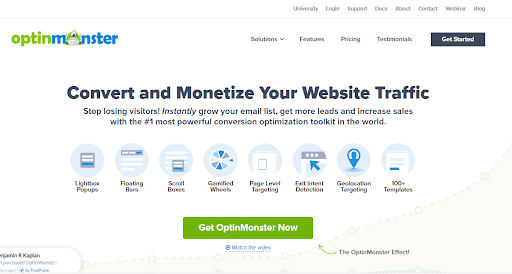
This is one of the most popular exit-intent popup providers. OptinMonster has a few features, such as A/B testing, that will help you create the perfect pop-up for your eCommerce store. With this app, eCommerce sites can create popups that increase leads and sales.
3. Exit Bee
Another popular exit-intent popup provider is Exit Bee. It offers a simple interface that makes it easy to create and customize your popups. It also includes features like A/B testing and real-time analytics.
4. Justuno
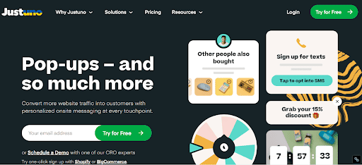
Justuno is another exit-intent popup provider that offers features like A/B testing and real-time analytics. It also includes a wide range of templates to choose from.
5. Pippity
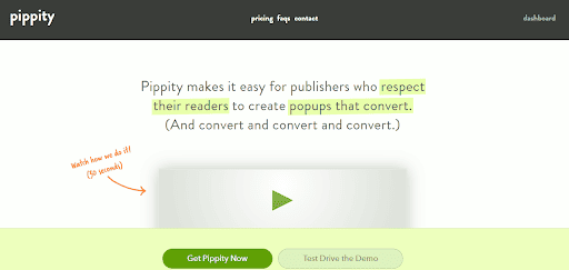
Pippity is a WordPress plugin that offers exit-intent popups as well as other types of popups. It includes features like A/B testing, behavioral targeting, and a wide range of templates.
6. Wunderkind

Finally, Wunderkind (formerly BounceX) is another exit-intent popup provider that offers a number of features, including behavioral targeting and webhooks.
Wrapping Up
If you’re running an eCommerce business, now is the time to ensure your website is optimized for conversions. One way to do this is by using exit-intent popups.
Exit-intent popups can be a highly effective way to increase conversion rates on your eCommerce site. By following these tips, you can create exit-intent popups that will persuade people to take action on your site.

Author Bio
Andre Oentoro is the founder of Breadnbeyond, an award-winning explainer video production company. He helps businesses increase conversion rates, close more sales, and get positive ROI from explainer videos.
You may also like…
Ecom Express vs Blue Dart: Which Courier is Right for E-commerce?
If you run an online store in India, chances are you've heard of Ecom Express and Blue Dart. Both are big names in the logistics world, but which...
read moreDelhivery vs Blue Dart vs DTDC: Which Courier Dominates Indian eCommerce in 2026?
In India, the logistics industry is driven by the 3 top players that provide courier deliveries and supply chain services for ecommerce companies....
read moreShiprocket vs Bluedart: Which Shipping Partner Wins in 2026?
Choosing the right shipping partner is a critical decision for any business involved in eCommerce. From delivery timelines and service reach to...
read more


